Why include information graphics?
In this day and age it’s more important than other to include visual elements in any kind of publication. Whether is a literary magazine, yearbook, or a newspaper, the reality is we live in a visual society and most people only retain 10 to 20% of what they see and hear, but they do remember 80% of what they see.
A few years ago I started including information graphics ( or as some people call them “alternative copy” stories) into my publication. This idea of data journalism is a growing field and it’s important to understand how to do it well. My students were a bit hesitant at first, but once we got into the creativity and innovation of the design, they ended up loving this unit!
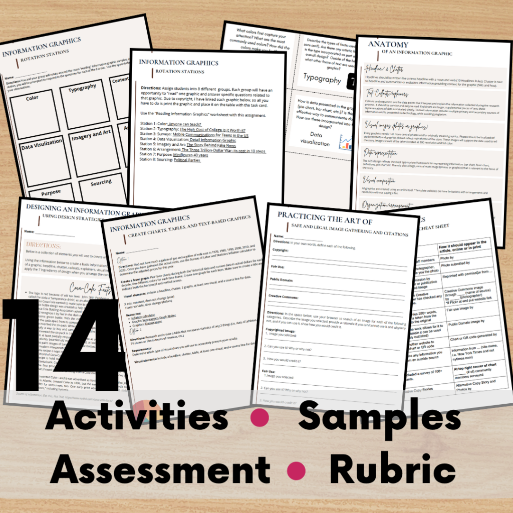
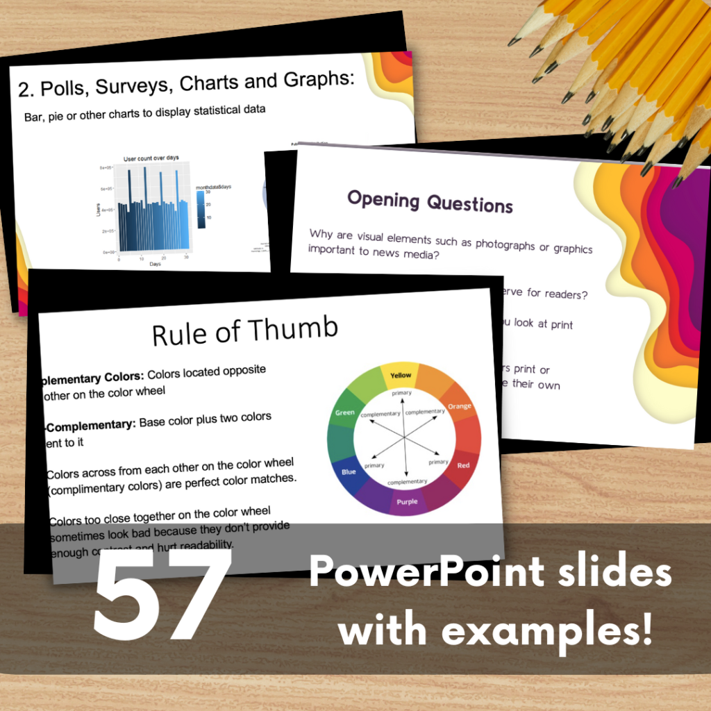
I typically spend about 2 weeks teaching my students how the basics of information graphics reporting. We learn about color, typography, how to research content and develop surveys, data visualization, imagery and artwork, and the overall arrangement.
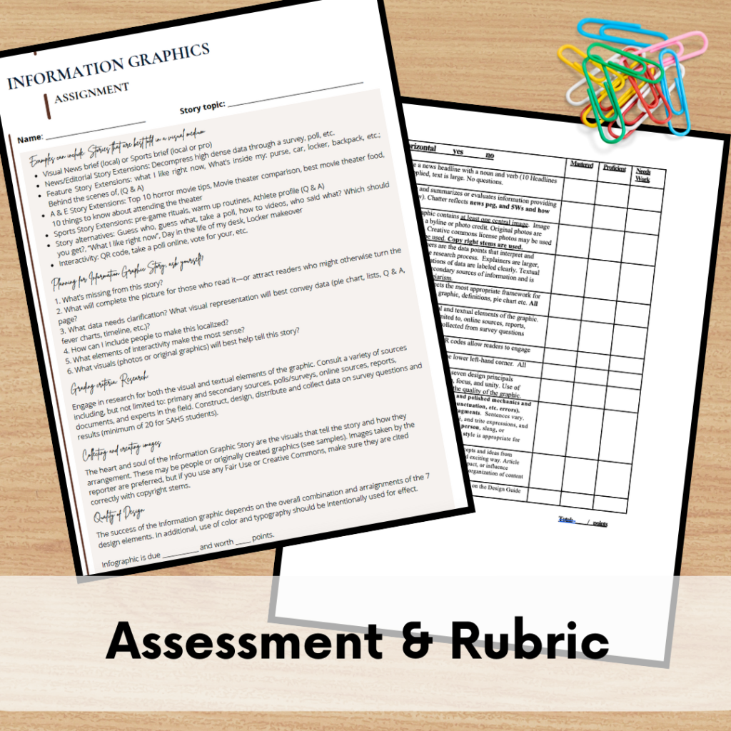
Research: It’s important to help students understand that researching for an informational graphic is just as important as if they were researching a traditional story. Students will still have to find primary and secondary sources, as well as conduct surveys when necessary. When we build the graphic, we use some of the same principles as storytelling: lead (chatter), fact paragraphs (callout), quotes (survey data or explainers), and visual images.
Content: When writing for an information graphic, students have to consider a variety of different content pieces:
- Headline
- Chatter
- Visual images
- Callouts
- Explainers
Information graphics are generally organized much in the same way as an article, including putting the most important contact at the top of the graphic and working the way down. The beauty of designing information graphic is that it pulls in so many different strategies of layout and design, so if your students are good layout editors, they’ll have a lot of different tools in there toolbox to design a visually pleasing graphic.
Design: When designing an information graphic, it’s important to consider some of the most important design principles that are fairly universal in all out in design.
- Balance: This means arranging the elements within your graphic so there’s balance both left and right as well as top to bottom. These don’t necessarily have to be exactly equal, but they should be somewhat balanced.
- Proportion: This is idea the idea that there should be some dominant image with any information graphic. If everything is big, nothing is big, likewise if everything is too small it’s gonna be hard for readers to really engage with the visual elements on the graphic.
- Contrast: The idea that this means that the human eye will notice more distinct changes within your graphic if you’re using a few contrasting colors. This could be contrasting colors in the color wheel, or simple contrast like black-and-white or shades of gray.
- Harmony & unity: In this particular strategy, designers should consider how well all of the different visual elements work together and there should be a visual flow from the upper left-hand graphic to the bottom right hand grab part of the graphic.
Color and typography: When designing information graphic it’s important for students to have some basic understanding of color theory and typography I spend some time teaching my students about primary colors, secondary colors and tertiary colors. I have them practice learning about the emotional impact of colors here are some of my most common tips for emotional color impact.
I also teach my students the difference between various typography families including Serif, Sans Serif, script, and novelty.
Putting it all together
Once my students have all of the foundational instruction in place, the fun part begins! I walk my students through series of scaffolded tasks to help teach skills related to information graphic design.
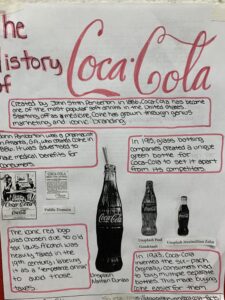
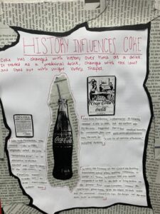
The first project I have my students do it create a Coke graphic. I give them some basic facts about the history of Coke, as well as a series of images. They use that content to create a sample information graphic demonstrating the Anatomy of an Information graphic concepts: headline, chatter, callouts, explainers, visual images, and byline.
Once students have demonstrate their understanding of the Anatomy of a Graphic, we learn about the different types of visual representations from bar charts to fever charts. They are assigned to compare any 2 things they want. Where it’s TV shows, cars, or athlete stats, they have to gather data and determine the best visual way to represent and compare that data.
Finally, I have my students create a final graphic that includes intentional use of color, typography, survey data, and visual representations.
Resource library
Sometimes it’s hard to help students visualize information graphics, so I put together a resource library of strong information graphics so they can see professional examples. Here are some of my top favorites!
